Our offices border on the rail yards and the industrial west side of Salt Lake. A perfect place for an Architect's office....er.... well, it does have panache and a sense of adventurous spirit to reclaim forgotten and discarded buildings and transform them into beautiful and stylish new neighborhoods. That is what skill and ability we bring to society isn't it?
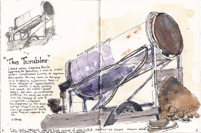
One of our neighbors is a stone masons yard. This piece of equipment takes cut and rough pieces and tumbles them around in this steel cylinder. It gives a distressed and interesting look to stone and smoothes sharp and abrupt edges.
I wanted to approach this sketch differently. I've been reading two books on painting by Bob Wade and Charles Reid; two veteran watercolorists that are also great teachers. Bob Wade encourages to make value sketches of the subject before painting to get your seeing eye to understand what values you need to represent. He also suggests squinting your eyes to really begin to see values. He feels if you get the values right you are on the way to having a successful painting. Bad paintings happen when the values are off. Charles Reid suggests to mix color right on your paper and concentrate on representing the values and colors as "shapes". That is, visualizing color, light, and value change as shapes that tend to create a sort of collage on your page. I tried some of both and came up with this sketch. I used a purple/yellow complement (ultramarine blue + carmine red & yellow ochre) color scheme to create its own mood and quality. I really liked the shadow shape on the dirt pile on the right. I didn't follow everything they suggested but hey.. I'm trying to find my voice, aren't I.
A pitfall I think I fell into that Bob Wade discourages is creating a value that may be too dark and creates a hole on the page. I think the value (although lighter than what I saw) of the opening of the tumbler is too strong. It focuses me into that area too much and in effect creates a hole on the page.
Using ink as a complement to watercolor is a nice combination and has always appealed to me. It also covers a multitude of sins as the ink adds to what the quick watercolor application can't. This sketch took 30 minutes from start to finish and falls under the limitations I've placed on myself when I sketch. I find if I limit my sketching time the more often I am likely to sketch. If I start churning out 2-3 hour or more sketches I'm less likely to sketch often. I hope I can find more time to sketch so my sketches can be more refined and then I can also do more larger and more time consuming paintings. A goal.....when children are older and work is less demanding; who knows.
2 comments:
WOW, thanks for the insight about creating a "hole". Yes, I understand what you are saying about the spot in your drawing. Maybe it needs more shape, in that it appears flat and there isn't depth in the opening. I wouldn't know how to fix that personally, but it is so helpful to have it explained with reference to Mr. Wade's instruction. I really like the overall drawing. I wish I could create such a detailed piece in such a short amount of time. Industrial scenes are a goldmine for unique structures to capture with line and color.
your sitetile was interesting. here is myhttp://www.usend1.net.or go to it from here tile
Post a Comment