Sunday, February 26, 2006

Yellow and Blue don't always make Green

Here is some color testing I did of Green. I am not yet finished as I want to see how Cad Yellow and Pthalo Green mix when glazed over. I have more success in mixing green (or shall I say I like the mixes better) when mixing P.G. with Quinacridone Gold. The various mixes with Q.G. are quite lovely.

Cad Yellow and the various blues I used failed to really impress me with the outcome except maybe for Cerulean Blue and Cad Yellow.

060226-cs5

060226-cs6

Technorati Tags: ,

Grotesque Profile

060226-sk64b

My copy after Da Vinci's sketch - J. Herbin ink with Bamboo pen

Technorati Tags: , ,

Sunday, February 19, 2006

Triad Color Studies

060219-cs3

060219-cs4

060219-cs5a

Tonight I went through three color triads I carry in my 12 well travel palette. The Opaque Triad, The Old Master's Triad, and the standard color triad (with a few handicaps). On future sketches I am going to try painting with these palettes (with the exception of the standard as I already paint this way) to understand the color relationships and also the potential of using fairly limited color palette. I really like some of the color relationships that are possible- -I really like how some of the opaque colors mix rather flatly yet dynamically- I also like the combination of Burnt Sienna and Payne's gray - they really are a great combination.

I also have come to a conclusion that I don't like using the cadmium colors (I use Cad Yellow and Cad Red Scarlet)- They tend to take over the mixes - which is a change since usually the yellow paints I've used in the past have been kind of wimpy (I wish I could find the perfect mixing yellow- any suggestions out there?). I also like the transparency of the watercolor not necessarily the opaqueness from some colors. I like the Opaque palette but Indian Red is another hard color to use but I really like the color triad- I will experiment more-much to discover.

Does anyone have any good suggestions on harmonizing a color palette? What to look for? Good tips? etc.

Having fun with an abandoned sketch

060219-sk62a

Here was a sketch that could have possibly been abandoned when the person I was sketching moved on. I ended up embellishing his hairs into Babylonian locks.

I also have been experimenting with mixing color right on the page especially with flesh colors. Adding a bit of permanent rose into a wet area of flesh color adds some life- maybe not like Charles Reid but I really like the unpredictable nature of mixing on the page and the strong colors it creates.

Sketching my little girls

060219-sk62b

060219-sk63

Here are some sketches I made Friday night - there were quick. I've yet to get their likeness just right- it is hard to get their features just right when they always move. sigh... I guess I keep trying.

Mimi's curls get a little out of control on the upper right hand sketch- oh well, I got carried away.

Bert Dodson in his book "Keys to Drawing" says that restating lines are to be consistently used to gain confidence and skill- but I'm not sure if it adds authenticity or just screws up the sketch.


Oh, and I finished up this first handmade sketch journal I made last summer- (I've begun to use the new sketch journal I made in January). Approximately 81 sketch pages I drew- It was a lot of fun and this sketchbook seemed more special than any I had before made. It seemed like the first sketchbook really. I have really grown with each sketch I made and they seem so alive to me. They have their own life and look unique from anyone else's. I haven't worried that they aren't perfect drawings but have been concentrating on trying to convey the emotions I felt at the time. This is a goal I don't know if I will ever attain but desire to communicate my thoughts and feelings into these quick records of my life in a way a skilled writer uses words.

Sunday, February 05, 2006

Color Study Journal

060205-cs2


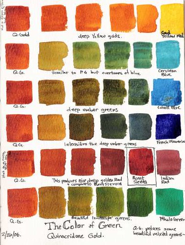
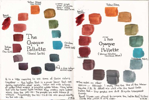
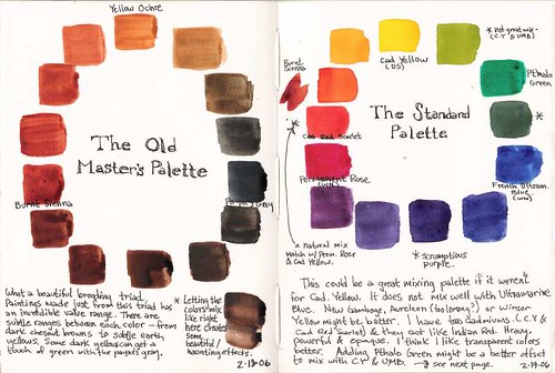
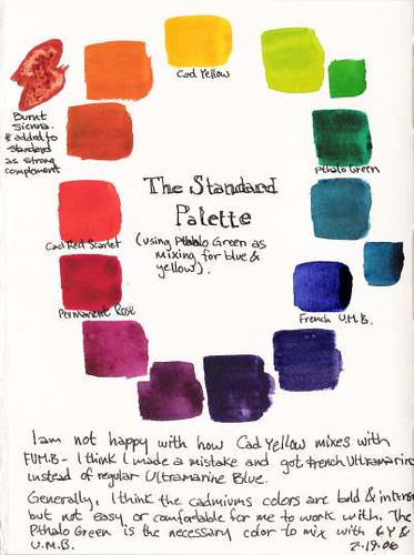
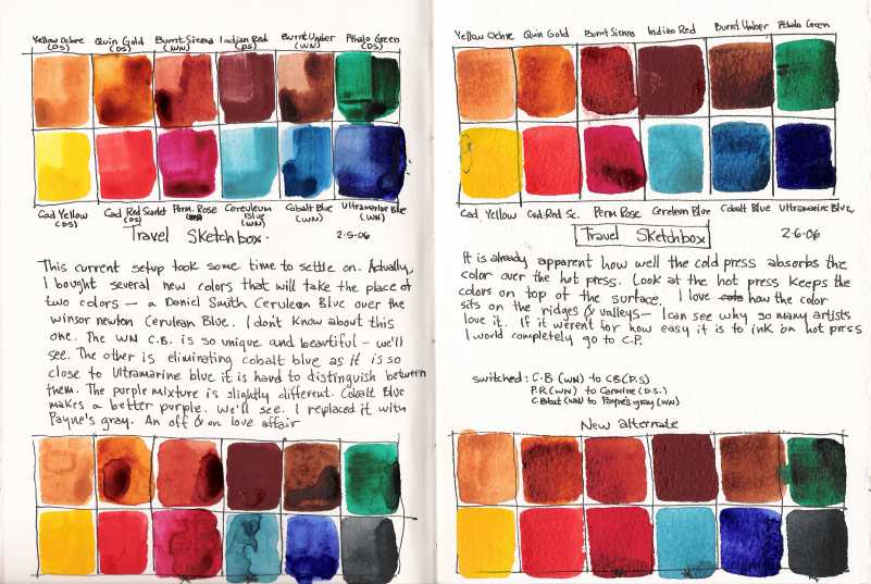
Here is the first page of my color study journal. It is the present state of my watercolor palette. I have been zeroing in on a color palette for the last two years and I have somewhat settled of late. This entry shows that I have recently switched out three colors. I am dumping cobalt blue as it is so close in hue to ultramarine blue- although cobalt blue makes better purples I use Ultramarine blue and burnt sienna quite a bit; I'm exchanging CB for my off and on love affair with Payne's gray. I also changed over to Carmine instead of Permanent Rose- I thought it might be a better magenta red. And I changed out my winsor newton Cerulean Blue to a Daniel Smith Cerulean Blue. Daniel Smith's is more cooler than WN's - I am having some grief with this change as I like WN's cerulean blue hue better.

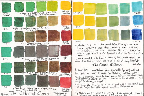
The main reason to make these changes as I am trying to maximize my watercolor's palette's ability to carry at least three color triads. A standard (Ultramarine blue, Carmine and Cad Yellow); an opaque palette (Cerulean Blue, Indian Red and Yellow Ochre); and the old Master's palette (Payne's Gray, Burnt Sienna and Yellow Ochre). Plus a personal bias towards earth tones (my love affair with landscapes) using Quinacridone Gold, and Burnt Umber in addition to the other earth tones already mentioned. I carry a warm red (Cad Red Scarlet), and a mixing green (Pthalo Green). The Pthalo green is so intensely powerful that I usually overuse it. I'm also having grief with Indian Red as it is also incredibly powerful and almost too opaque and muddy. But I am determined to use it until I understand it better.

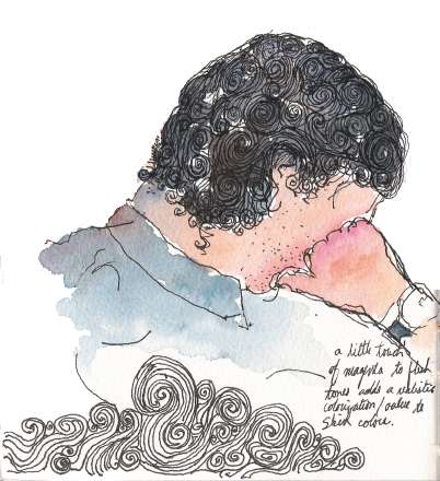
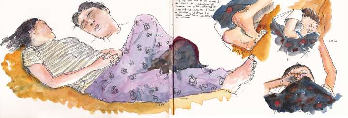
This journal is made up with alternating pages of Fabriano hot press and cold press papers as to see the effects of color on each paper type (you can see from the image above that I duplicated the study to see the effects of the paint on the paper- hot press on the left and cold press on the right). I will mainly use this journal to record my color experimentations. I found that the color studies I made in my other journal get separated in all the day to day recordings and I find when I need to reference back to these studies that it isn't close at hand- therefore the need to maintain a separate journal.

My new Figure Study Journal

060205-fs1

060205-fs1-2

Here are the first three pages of my new figure study journal. One of the three new journals I made as a goal for 2006. This journal is the hardest to pick up as I am so intimidated by sketching people. Especially if the sketches don't either look like the people you sketch or they make them look wacked, fat or just flat disgusting. Jenny, my dear wife, was upset at me at the sketch I did of her. The profile of her face (full stretched out) is off and makes her look as if her face was smashed; and to top it off the detail of her face made her look fat- and that almost got me a night on the couch ;-). Oh well, I'm no Monet and my family are the unfortunate victims of my education. [hopefully you can read through my hyperbole- my wife and family are very supportive- Jenny is just waiting for me to be able to draw her as beautiful as we really see her].

Self portraits are fun- and you can do almost any bizarre pose.

Sketching Felines

060205-sk61

Here are two of our four rambunctious cats. Tiger, our only male- and mitzi - our 6 month old female. Sketching cats on the move is somehow less intimidating than people. Although you may not get their features quite right they still look somewhat like cats.

Sketching from Memory

060205-sk59a

Sketching from memory is a real drag. It usually means that my subject either moved or else I ran out of time before I needed to move on. As it sometimes goes that when people notice you drawing them they either get uncomfortable themselves and fidget and move around and I lose their pose- like this sketch; or they start exchanging glances at you wondering what the heck you are doing--- either stalking them if you have a conspicuous sized sketchbook and they don't see you sketching or if they realize they're being sketched they will not know what to do and become uncomfortable.

Instead of stopping and moving on to another subject I tried to finish the sketch and created this unfortunate drawing. I know there are some artists who are so good at sketching the human figure that they only need a few critical features before they have the whole likeness. Artists who can multi-task like this when sketching is a skill I desire to attain. Gesture drawings look at making a 30 sec - 1 minute drawing as effective as possible.

Memory, Observation and Blindness

060205-sk58b

This was a study using three sketching techniques that Bert Dodson sets out in his classic book "Keys to Drawing". I sketched a banana from memory, the next on observation and the last as a blind contour. The observation and blind contour is by far the most interesting. It is interesting to note that sketching from memory usually entails borrowing figurative metaphors from my cognitive side which usually screws up everything. When I depend on symbols and memory my drawings suffer greatly.

Winter Sketching

060205-sk58a

Winter can be so bleak but I am always so excited to see all the beautiful trees loose their leaves and I am able to see their naked frames. Trees can have the most beautiful structures. To think when spring comes that thousands of little leaves will find their way beautifying this graceful beauty once more.

This drawing/sketch seemed a little two-dimensional because I spent so much time given texture to the tree that I didn't spend much time on value and light study. Interesting nonetheless.

Technorati Tags: , ,

Sketching in Church

060115-sk55b

060205-sk60

Here am I enjoying my time listening [maybe enjoying drawing a little bit more ;)] to the speakers at Sacrament Meeting at two separate times. I find that as I am sketching people that I really need to observe keenly so I can get a satisfying sketch. Usually I rush because people are moving too quickly and I really stink at capturing people on the move. These drawings focus on either other Ward members listening intently or sleeping.

One of my serious goals is to study and understand figure drawing. I really want to excel at gesture studies like Sketchcrawl creator- Enrico Casarosa

A New Direction

As much fun it is to post these drawings - it seems to take a lot of time to spend scanning, proofing, editing, and posting to the internet .... etc. etc. than I find I have time to do. Mostly I find that I am able to do this on Sunday evenings as the family is winding down and myself as well.

So....I think I will take a new direction at posting only on the weekends so I can feasibly take the time and not feel forced to do something I actually enjoy. If not I don't find myself posting at all. Actually, I am drawing quite a bit lately- meeting and exceeding my 2006 goals I set. So Tonight I present the sketches I have produced over past couple of weeks....