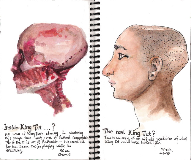
National Geographic is such an awesome magazine. It has tons of interesting stories with fascinating photography each month. I can't help sketch the images into my visual journal. I did these sketches of King Tut while the kids were playing on the jungle gym at McDonalds after enjoying a treat for Family Night. The first sketch was a copy of a MRI scan of King Tut's mummy. It was quite horrific and made an interesting sketch. The second sketch was of an artist's perception of what the King might look like. I am unsatisfied with this sketch- it looks too hokey and flat- I plan to rework it but before I did I thought I might at least document the before and after; especially since I have a sinking feeling I'm going to destroy it. I feel I am constantly battling myself about experimenting and not feeling the sketch is too precious and also creating something that is worthwhile and memorable. Usually my best pieces are those I haven't worried about the outcome; I just did it and was pleasantly surprised at the results. Usually it was because I was mindful of all the critical thinking (ie, proportion, scale, light, shadow,
value, color, and good
seeing).I have been going through Robert Wade's Workshop book and he feels every drawing, painting, sketch (whatever) can be salvaged. One of the main problems is value. Most paintings are unsuccessful because they miss the values- I really have to agree with that. There are several other factors that contribute to a successful painting but they can be subjective and personal- value is a very objective criteria that can be equally judged across the board. The sketch on the right is flat and lacks vibrancy; we'll see if I can fix it. :-(


No comments:
Post a Comment