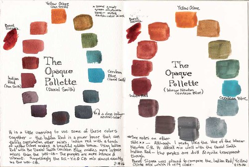
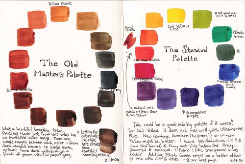
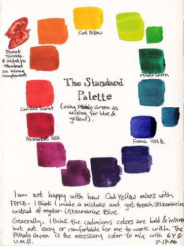
Tonight I went through three color triads I carry in my 12 well travel palette. The Opaque Triad, The Old Master's Triad, and the standard color triad (with a few handicaps). On future sketches I am going to try painting with these palettes (with the exception of the standard as I already paint this way) to understand the color relationships and also the potential of using fairly limited color palette. I really like some of the color relationships that are possible- -I really like how some of the opaque colors mix rather flatly yet dynamically- I also like the combination of Burnt Sienna and Payne's gray - they really are a great combination.
I also have come to a conclusion that I don't like using the cadmium colors (I use Cad Yellow and Cad Red Scarlet)- They tend to take over the mixes - which is a change since usually the yellow paints I've used in the past have been kind of wimpy (I wish I could find the perfect mixing yellow- any suggestions out there?). I also like the transparency of the watercolor not necessarily the opaqueness from some colors. I like the Opaque palette but Indian Red is another hard color to use but I really like the color triad- I will experiment more-much to discover.
Does anyone have any good suggestions on harmonizing a color palette? What to look for? Good tips? etc.
6 comments:
hi, try this link and click on palette
http://www.handprint.com/HP/WCL/water.html
mrspdvn
Check out one of my (Lamy's) posts on the Artworkbook message board. I listed the colors I use in my palette, the main and secondary. My main and a few secondary are all transparent. Jeanne Dobie does a great job of describing working with transparent colors. However, watch out for the non-lightfast colors that she recommends. Last year, I finally got around to exchange them for lightfast alternatives that work equally well, if not better.
I appreciate the link to Handprint- I found that site about a year and a half ago- great information but it leaves you with the idea of using 3 or 4 alternatives- some of which I have used but unfortunately choosing paints can be quite subjective- maybe I'm asking the wrong question.
Thanks Lamy for the tip. Jeanne Dobie recommends Cadmium Yellow which I already use. A great pigment - I just find I'm intimdated by the powerful effect it has on mixing. Not a great mixer with French Ultramarine Blue. I haven't used Transparent Yellow thought- I'll keep that in mind.
The reason CY does not mix well with FU is that CY is a reddish yellow and FU is a reddish blue. Thus, mixing the two is like mixing yellow, red, and blue - which becomes gray!
The solution is to mix a yellow and a blue without any red in them; I mix Transparent yellow with Cobalt blue or Winsor blue.
/Lamy
Good point Lamy, I know I've used it with Cobalt Blue before - I'll have to rework that color study.
Usually to make greens and shades of green I use Pthalo Green with mixtures of CY, FU, or Quin Gold (which gives great landscape greens).
I took a watercoloring class last semester and my favorite triad was the velazquez triad; ultramarine, burnt orange, and raw sienna.
Post a Comment