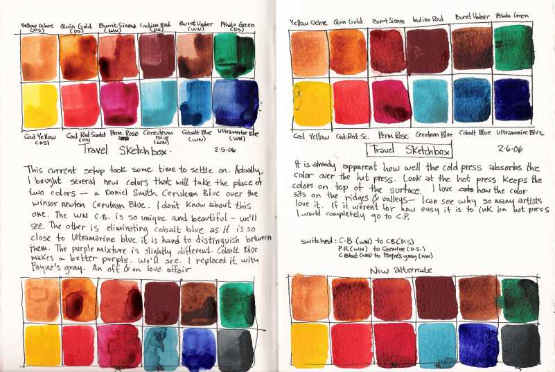
Here is the first page of my color study journal. It is the present state of my watercolor palette. I have been zeroing in on a color palette for the last two years and I have somewhat settled of late. This entry shows that I have recently switched out three colors. I am dumping cobalt blue as it is so close in hue to ultramarine blue- although cobalt blue makes better purples I use Ultramarine blue and burnt sienna quite a bit; I'm exchanging CB for my off and on love affair with Payne's gray. I also changed over to Carmine instead of Permanent Rose- I thought it might be a better magenta red. And I changed out my winsor newton Cerulean Blue to a Daniel Smith Cerulean Blue. Daniel Smith's is more cooler than WN's - I am having some grief with this change as I like WN's cerulean blue hue better.
The main reason to make these changes as I am trying to maximize my watercolor's palette's ability to carry at least three color triads. A standard (Ultramarine blue, Carmine and Cad Yellow); an opaque palette (Cerulean Blue, Indian Red and Yellow Ochre); and the old Master's palette (Payne's Gray, Burnt Sienna and Yellow Ochre). Plus a personal bias towards earth tones (my love affair with landscapes) using Quinacridone Gold, and Burnt Umber in addition to the other earth tones already mentioned. I carry a warm red (Cad Red Scarlet), and a mixing green (Pthalo Green). The Pthalo green is so intensely powerful that I usually overuse it. I'm also having grief with Indian Red as it is also incredibly powerful and almost too opaque and muddy. But I am determined to use it until I understand it better.
This journal is made up with alternating pages of Fabriano hot press and cold press papers as to see the effects of color on each paper type (you can see from the image above that I duplicated the study to see the effects of the paint on the paper- hot press on the left and cold press on the right). I will mainly use this journal to record my color experimentations. I found that the color studies I made in my other journal get separated in all the day to day recordings and I find when I need to reference back to these studies that it isn't close at hand- therefore the need to maintain a separate journal.
4 comments:
wish'd it wasn't so late and I had more time, I would comment on all of these, sorry, will have to suffice to say I think this latest batch of sketches are all wonderful!
A color journal is a great idea. I've had the same problem. I'll make palette pages and then lose track of which journal each palette is in. So I'm going to steal your idea. That being said, a question: the picture of your journal pages indicate that it is string bound and you say you're using hp and cp papers, did you bind this yourself?
AJ
Yes I bind all of my sketch journals myself. I never could find a sketchbook that met my needs- and plus I can make a high quality watercolor sketchbook cheaper than buying anything on the market.
To make your own takes a little research and a little courage to jump into. Most hand bound books can be made in one evening if you have all of your materials.
I'm looking for info on binding - my sketches are from various books and I want to get them together for submission to an art school.
Any hints you could give would be welcomed!
Debbie
Post a Comment