I have felt like a received a most enlightened lesson this week. Awhile back one of the members of the "artworkbooks" yahoo group spoke about Jeanne Dobie's book "Making Color Sing". I have read about it before on Bruce MacEvoy's great website Handprint but Bruce hammer's away at the "old school" who espouses the use of fugitive pigments like Rose Madder Genuine and Alizarin Crimson or Aureolin. I liked his review of her book but since she used these pigments I thought it wasn't worth the time- how wrong I was. Her palette discussion is just one of a treasure load of excellent color theory lessons.
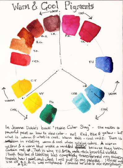
One of which rang so true and made so much sense was on warm and cool pigments in your palette. I always thought of colors by hue and chroma. I didn't think that there were inherent characteristics that prejudged the outcome of mixtures. Like mixing French Ultramarine blue (FU) and Cadmium Yellow (CY). I always got mud from this combination but didn't understand why- FU gave beautiful violets when mixed with Permanent Rose (PR) why did it fail at creating green. One reason is that CY has a little red in it as well as FU and when combined it gave a orange bias to the mix which cancels the blue. Therefore a better choice would to use a cool yellow like Winsor Yellow or Hansa Yellow Light and a cool blue like cobalt blue or even better- phthalo blue which bends a little towards the green and makes better greens. Well, there are many other such discoveries that I made that I am questioning my current palette even more. Pigments such as Yellow Ochre, Burnt Sienna and Burnt Umber are pigments made from 3 pure pigments. Jeanne makes a great case against such "impure" pigments; by using more pure pigments you have a greater chance of getting more exciting mixes. I'll have to experiment a bit and we'll see, but I feel my next uses of color will be more informed. I am a little unsure I have to throw all of the earth pigments out- as they provide such a easy way of creating deep browns and grays- but I will be a little more educated as I continue painting.
One other quick discovery is the spare use of opaques which I've always agreed on but never understood why. Using an opaque with another opaque creates dull and unmanageable mixtures. Although I haven't done many experiments with the Opaque Triad- I could see her point. Whenever I've used two opaques the mixture was hard to work with - even frustrating.
Great discoveries.
10 comments:
Isn't her book wonderful? I really love her explanation of color theory and the way pigments act. I've really benefited from the concept of lifting versus staining pigments, and "correct" order to do glazing sequences. However, I'm with you on being concerned about te fugitive nature of some of the pigments, and not being willing to abandon the earth pigments! :-)
But although she uses these fugitve pigments - she does offer some substitutes from the Daniel Smith line on her website. She unabashedly holds on to Rose Madder Genuine though.
Interesting post Puhiava! Handprint is an amazing site chock-a-block with info. I reccommend Dewey's book to learn alot on pigment characteristics..David uses tons of opaque colors, especially the Cadmiums but he dilutes them and uses them to charge washes as well. I think there's more to it then Dobie covers, though I like her concepts.
BTW when I visited W & N I saw how they make Rose Madder Genuine in big wooden vats, still the old Victorian way..the only thing they still do the "old" way unfortunately...
This is one of my all time favorite books! And there really isn't yet any good substitute for rose madder genuine, in a lot of cases, and believe me, I've searched!
Now, let's see those grey charts! :-D
How funny -- I just noticed the date on this post, and that I'd already commented on it some time ago! See, I hold by what I say, time does not change my mind!
(ROFL!) I KNEW that chart looked familiar!
I miss your posts and your art! Your work is awesome! I live in Orem, are you still in AF? Just started my own blog, take a peek. Would love to see more of your work.
Just found your blog - very nice! I see you haven't been posting; I hope you're still sketching :)
This is the first comment I have ever left here and it's not because I didn't want to say anything, but it's because there was nothing to say. I always enjoy the work as well as the read, and even though I have been coming here for a few years, I just wanted to get around to saying "AWESOME"!
puhlava, i regret that my disdain for dobie's choice of pigments deterred you from reading her excellent book. and i'm not sure why you drew that conclusion from my book review. the review concludes this way:
"I found Dobie [dobie's book] remarkably insightful and accurate, and still learn with delight from chapters I've read many times."
Thank you Bruce for clarifying the quote of your review of Jeanne Dobie's book. If you read my post carefully you'll see that not only did I read her book but was greatly influenced by it. Thank you for the great work of yours on Handprint I love spending time on it.
Post a Comment